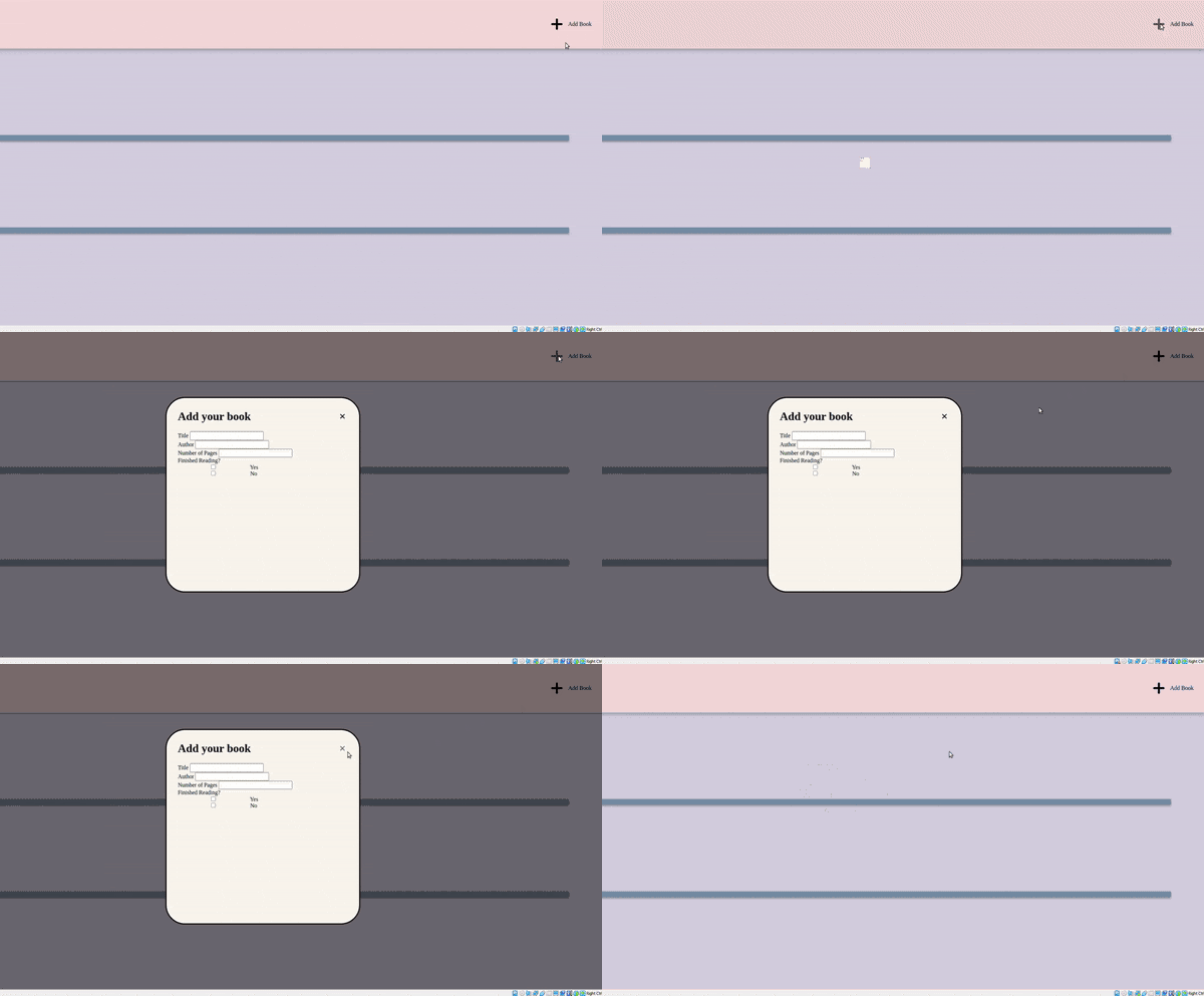
Modal Final Product
This guide will go through the basic building blocks required to design a modal, make sure to add your own styling to make it look good!
This is an example from a project I've been working on (with additional styling)

HTML components
These are the basic components are listed below. Remember what IDs & classes you've given the elements, you will use them later when selecting it in JavaScript.
- button: to open the modal
- Modal
- modal content
- modal header
- close button
- overlay: this darkens the rest of the screen when we open the modal
<button id="open-modal">Open Modal> </button>

<div class="modal">
  <div class="header">
    </h1>Modal Header<h1>
    <button id="close-modal">%times; </button>
  </div>
  <div class="content"> random modal content here</div>
</div>

<div class="overlay"></div>
CSS
Modal
We need to style two different classes of modal, what it looks like after the user has pressed the button and when it's hidden. To do this, we will style an active class, later on in JS we will use this class to toggle between hidden and active.
The hidden modal should have the following characteristics:
scale(0)hides the modal when it's not activez-indexis used to make sure our modal appears above other elementstranslateandtransformmoves our modal to the center of the screentransitionallows our modal to smoothly transition onto the screen
.modal {
  position: fixed;
  top: 50%;
  left: 50%;
  transform: translate(-50%, -50%) scale(0);
  transition: 200ms ease-in-out;
  border: 1px solid black;
  border-radius: 10%;
  z-index: 10; //want out modal to draw above everything else
}
The active modal should have scale(1) so that it appears above all other elements.
.modal.active {
  transform: translate(-50%, -50%) scale(1);
}
Overlay
We want this be darken the screen behind the modal when it is active.
When the modal is hidden
positionwith 0s in so it stretches to all corners of the screenopacityshould be 0 so it is hiddenpointer-events: none;so that items on screen are clickable otherwise the modal is still covering everything
.overlay {
  position: fixed;
  top: 0;
  bottom: 0;
  left: 0;
  right: 0;
  backround-color: rgba(0,0,0,0.5);
  pointer-events: none;
  transition: 200ms ease-in-out;
}
When the modal and overlay are active
- has
opacityof 1 so it is visible pointer-events: all;so users are not able to click on blacken area
.overlay.active {
  opacity: 1;
  pointer-events: all;
}
JavaScript
There are 3 main components
- Select element from HTML into JS
- Write function that opens and closes modal
- Connect function and button elements
//Select buttons that open and close modal
const openModalButton = document.querySelector('#open-modal');
const closeModalButton = document.querySelector('#close-modal');
const overlay = document.querySelector('#overlay');
const modal = document.querySelector('.modal');

//Connect button element with function
openModalButton.addEventListener('click', openModal);
closeModalButton.addEventListener('click', closeModal);

//open modal function
function openModal() {
    form.classList.add("active");
    overlay.classList.add("active");
}

//close modal function
function closeModal() {
    modal.classList.remove("active");
    overlay.classList.remove("active");
}
Conclusion
That's it! I hope this guide helped :)
