


To create animations with CSS and JS to need to style what the element looks like
- before animation
- after animation
I will be using
.activeclass selector for the "after" animation styles in JavaScript.
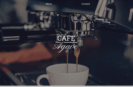
Simple Animation
The following examples only require CSS and HTML. We need to understand the following properties:
transition: allows you to change property values smoothly over a given durationopacity: specifies the transparency of an elementtransform: lets you rotate, scale or translate an elementpointer-events: lets you control how HTML elements respond to mouse/touch events
To use these properties to animate elements, we need to style the element to what we want it to look like before and after the animation. This is my example:

HTML
    <body>
        <section class="parent">
            <button>Click Me</button>
            <div class="text-element">Hello World</div>
        </section>
    </body>
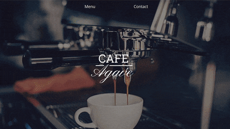
To achieve this animated look I initially set the CSS of the text element to this
.text-element {
    color: purple;
    font-size: 10rem;
    background-color: transparent;

    opacity: 0;
    pointer-events: none;
    transform: translateY(-3rem);
    transition: opacity 200ms ease-in-out, transform 200ms ease-in-out;
}
- we want the text to have an initial
opacityof 0 so it is hidden - we want the
pointer-events: none;so that users can't accidentally click on it while it is not visible (not so important for this example, but you'll find this handy for future projects) transformin the Y direction is used so that the text has the appearance of sliding downwardstransitionis applied to this base element and dictates how long it takes to change from initial to final properties
CSS for what the element will look like after transition, while user is clicking the button:
button:focus + .text-element{
    pointer-events: auto;
    opacity: 1;
    transform: translateY(0px);
}
- We are selecting the CSS pseudo-class
:focus, so that when the user interacts with the button, the property styling will be applied to thetext-elementwhich makes it visible.
Smooth scroll
The effect smooth scroll looks like below, and is really simple to achieve.
This only requires one line of CSS
html {
    scroll-behavior: smooth;
}
The downside is that it is not cross browser compatible, check which browser it'll work for here.
Another method we can use to implement smooth scroll is via using this github repository: github.com/cferdinandi/smooth-scroll. This would work across all browsers, simply copy the CDN link into your HTML and use the following JS code.
HTML
<script src="https://cdn.jsdelivr.net/gh/cferdinandi/smooth-scroll@15.0.0/dist/smooth-scroll.polyfills.min.js"></script>
JS
const scroll = new SmoothScroll('a[href*="#"]');
Intersection Observer
Why should we use Intersection Observer? It's great for:
- infinite scrolling
- lazy loading images
- scroll based animation
So, what is Intersection Observer?
Intersection Observer calls a function when a target element "intersects" with another element. This target element is by default the viewport.
Therefore, a callback function will be called when an element becomes visible to the user via scrolling
We need to use new IntersectionObserver constructor function with .observe() method.
Have a look at this example code:
CSS
.menu {
  opacity: 0;
  transition: opacity 600ms ease-in;
}

.active {
  opacity: 1;
}
Step by step JavaScript code
const observer = new IntersectionObserver(function( ), options)
IntersectionObserverhas 2 parameters: a callback function and options for how to configure it.
const observer = new IntersectionObserver( entries => {
   entries.forEach(entry => {
      console.log(entry);
    })
})
- Callback function takes in a list of entries, which are all the elements that have "intersected" or are visible. Therefore, we need to use
forEachto loop through each element
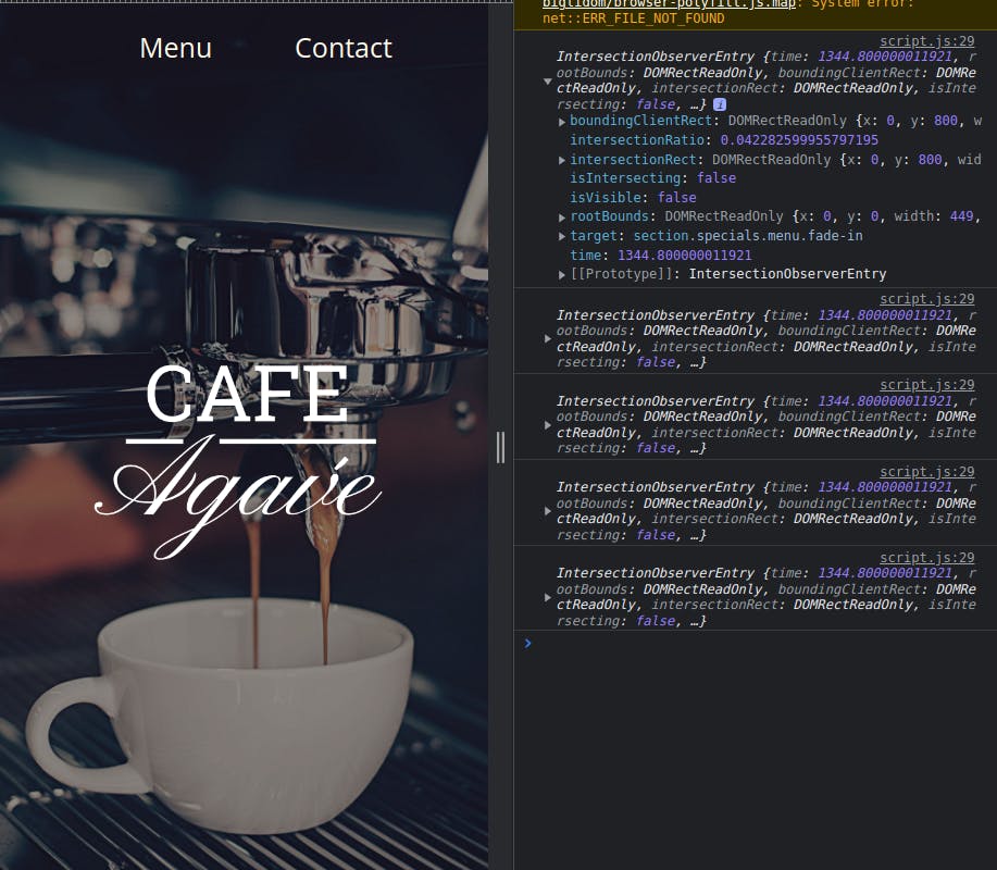
- from using
console.logwe can see that theIntersection Observerfires all the elements as soon as the page loads - We don't want all our elements to be firing even when they are not visible, so we need to add an
ifstatement
const observer = new IntersectionObserver( entries => {
   entries.forEach(entry => {
        if (entry.isIntersecting){
            entry.target.classList.toggle("fade-in");
        } else {
            return;
        }
    })
})
entry.isIntersectingreturns true or false depending if the element is visible or not, so when element is not visible we exit out of function- When element is visible we add
.activeclass which animates the element
const observer = new IntersectionObserver(
  entries => {
    entries.forEach(entry => {
        if (entry.isIntersecting){
            entry.target.classList.toggle("fade-in");
        } else {
            return;
        }
    }, {
  threshold: 0.5;
  })
- Options: By default the
thresholdis 0, which represents 0%. This means as soon as one pixel of the element is visible the function will be called. This results in the animation happening too fast, therefore I am setting it to 0.5.
const menus = document.querySelectorAll(".menu");

menus.forEach(menu => {
    observer.observe(menu)
}
- We need to use
observe()to observe when the element changes intersections observer()only takes in one element at a time, therefore we need aforEachloop to go through each element we want to animate- note: I applied a class of
.menuto all the elements I wanted to animate shown by the gif example
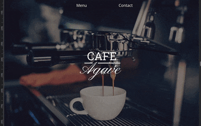
Now our code does this:
Notice how the elements are constantly fading-in and and fading-out, if we want out elements to not keep disappearing, like the first gif example, we can add this line of code to the JS:
const observer = new IntersectionObserver(entries => {
    entries.forEach(entry => {
        if (entry.isIntersecting){
            entry.target.classList.toggle("fade-in");
      //entries don't animate away
            observer.unobserve(entry.target);
        } else {
            return;
        }
    })
}, {
    threshold: 0.5,
})
- we will now
unobserveany element that is visible, which means it'll stay static after user has scrolled away
Other useful options
rootMargin: -100pxmakes our intersecting container 100px smaller from the top and bottom.+100pxmakes our intersecting container 100px larger which can be useful for pre-loading images before user scrolls to it.rootby default is set to the viewport but we can change it to any ancestor element
Conclusion
If you want to see the code for my cafe-website check it out here