


I've compiled this cheat sheet so I can quickly reference grid syntax without needing to look all over the internet. Hopefully you'll find it useful also!
Container
Setting Columns & Rows
Set container as grid
- display: grid;
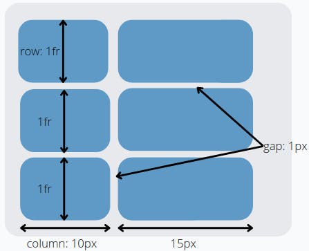
Define number/size of columns and rows. Each value represents a new column or row.
- grid-template-columns: 10px 15px;
- grid-template-rows: repeat(3, 1fr);
- grid-template: row value / column value;
Set size of space between column and/or row
- grid-row-gap: 1px;
- grid-column-gap: 1px;
- gap: 1px;
Define size of newly added columns and/or rows that weren't explicitly defined with grid-template
- grid-auto-rows: 10px;
- grid-auto-column: 1fr;
Responsive design
min(value, value) and max(value, value) returns the minimum and maximum value, respectively, within the bracket.
- grid-template-rows: repeat(3, min(200px, 50%)); sets the maximum height for the row to 200px, otherwise it'll be 50% of parent space.
- grid-template-columns: repeat(3, max(120px, 20%)); sets the minimum width for column to 120px, otherwise it'll be 20% of parent space.
minmax(min value, max value) is used to set both minimum and maximum size of grid. The item will not shrink or grow pass set value.
- grid-template-rows: repeat(2, minmax(100px, 200px));
clamp(min size, ideal size, max size) the ideal size value should be a relative value. The item will grow and shrink up to set boundary values.
- grid-template-columns: repeat(3, clamp(100px, 80%, 200px)); the column width will remain at 80% until it reaches width of 100px or 200px.
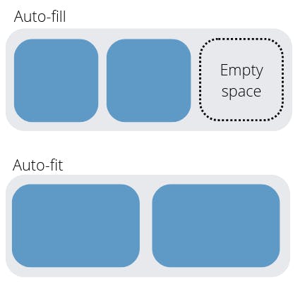
auto-fit and auto-fill are used with the repeat function. These functions will fit as many rows/columns into parent container using the minimum size. It will then resize the space up to the maximum value stated.
- grid-template-columns: repeat(auto-fit, minmax(300px, 1fr)); If the container is 1000px wide it will fit 3 columns, if it changes to 700px it will automatically resize to 2 columns.
The difference between auto-fit and auto-fill is that auto-fit will fit the columns into the available space while auto-fill will add new empty columns and revert previous columns to it's minimum size.
Content Alignment
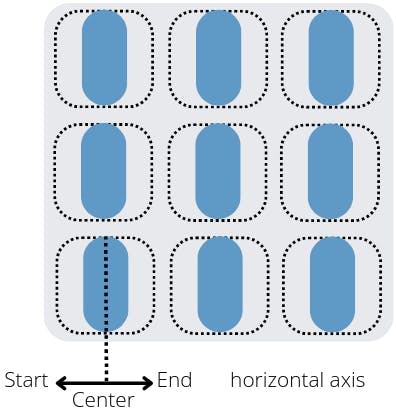
Align content within grid item along horizontal (justify) or vertical (align) axis. Possible values: start, end, center, stretch (default).
- justify-items: center;
- align-items: end;
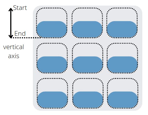
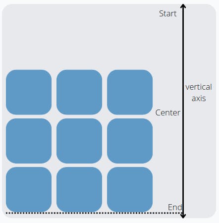
Align all grid content along horizontal (justify) or vertical (align) axis if there is extra space in container. Possible values: start, end, center, stretch, space-around, space-between, space evenly.
justify-content: start;
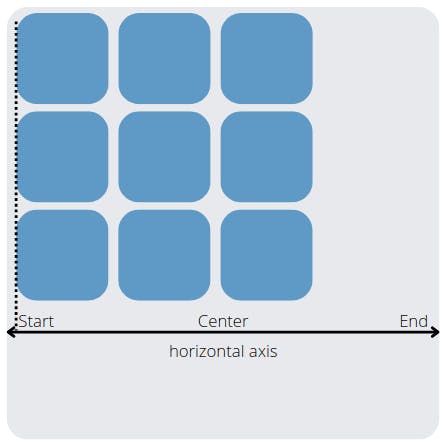
align-content: end;
Children
Specify starting and ending of specific child element. Value span 2 can be used instead of identifying column/row number.
- grid-column-start: 1;
- grid-column-end: 3;
- grid-column: 1 / 3;
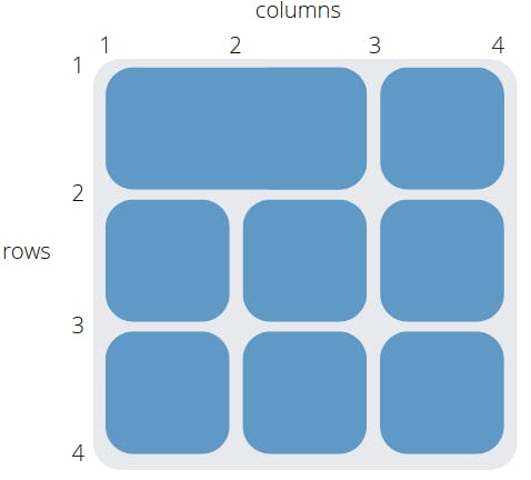
- grid-row-start: 1;
- grid-row-end: 3;
- grid-row: 1 / 3;
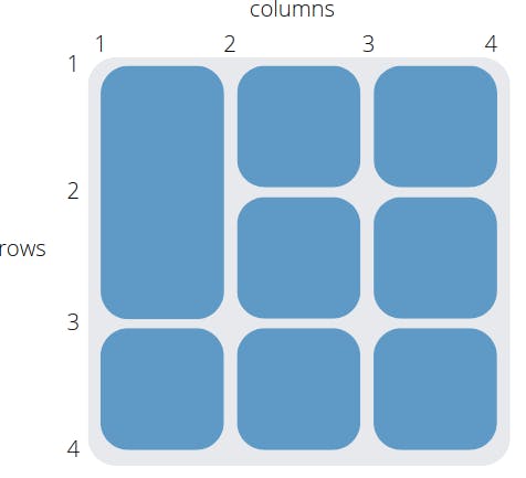
This property can be used to combine grid-column and grid-row into one line
- grid-area: grid-row-start / grid-column-start / grid-row-end / grid-column-end; e.g. grid-area: 1 / 1 / 3 / 3;
Align specific child element within it's grid along horizontal (justify) or vertical (align) axis. Possible values: start, end, center, stretch (default).
- justify-self: start;
- align-self: start;