

When I was first learning about flexbox, grid and all the different properties I could use to position elements I was definitely confused. I've written a summary below to clear up some misunderstandings for myself and hopefully you'll find it helpful as well.
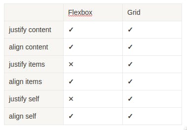
This table shows an overall overview of when you can use a certain property.
Justify vs Align what's the difference?
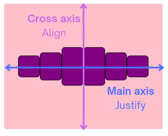
Whenever we align items in flexbox it’s important to understand that there are two axis we can reference
- main axis
- cross axis
When display is flex, by default the flex-direction is flex-direction: row. This means the main axis runs horizontally across the screen and cross axis runs vertically. Whenever we use “justify” we are aligning elements along the main axis and “align” uses the cross axis.
 If we wanted to switch the direction of the axes we can add
 flex-direction: columns. For grid it’s more simple, as justify will always align items horizontally and align will align items vertically.
Content vs Item
Both content and items align the children elements within their parent container but in different ways
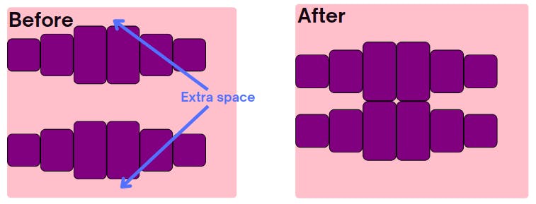
- "content" aligns the children elements within the extra leftover space in the parent element
- "items" aligns the children elements within the row they live on
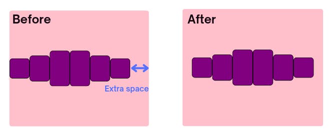
Let's look at some examples to make this more clear. justify-content: center aligns all children elements within the center of the main axis. If there is NO extra space available in the parent container, adding this property won’t change how it looks as there is no extra space to distribute the children elements.
 Align-content works the same as justify-content, except we are now manipulating the cross axis. However, since we need extra space to actually distribute the children elements, align-content only works when there are multiple rows. E.g.
 align-content: center does the same thing as justify-content: center, but in the cross axis.
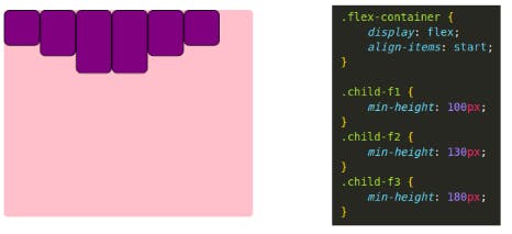
When we use “items” either with align-items or justify-items we are aligning the children elements within the row they currently live on. By default align-items is set to stretch on flexbox so it fills up as much as space as possible in the cross axis.
 If we want all children elements to align to the top of the row we can use
align-items: start. When align-items: stretch is no longer the default, the set height of the children elements show.
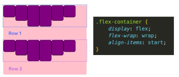
 If there were two rows, the children elements will align to the top of the row they live on.
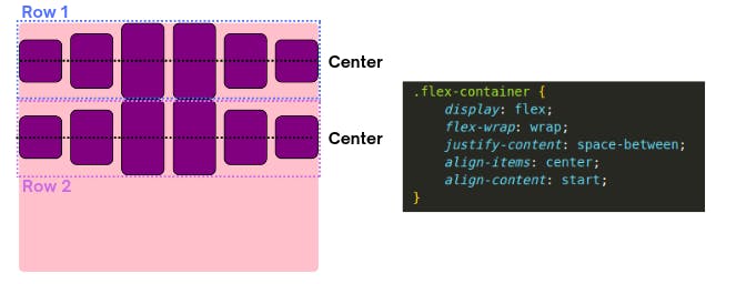
 To clarify the difference between align-item and align-content, let's check out an example using both.
 align-items: center centers the items within the row they live on and align-content: start moves all children elements to the start of the parent container.
 All these examples works the exactly the same for grid and flexbox. However, justify-items does NOT work with flexbox due to it's one dimensional nature.
When to use justify-self and align-self
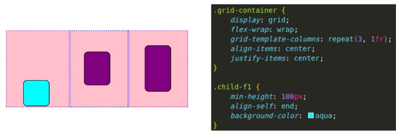
Justify-self aligns an item inside it's block boundary horizontally and align-self aligns the item vertically. It is used to override a grid or flex's item's align-items value so it is applied directly to a child element. This example below is aligning the first child to the end of it's grid block using align-self: end.
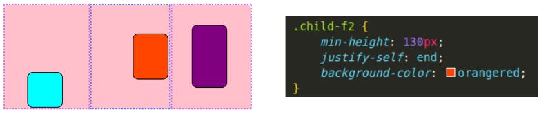
 This example uses
 justify-self: end and aligns the second child at the end of it's box horizontally.
Conclusion
Practically with flexbox the most commonly used properties would be justify-content and align-items. Align-self and justify-self are often used with grid if you want to change the position of one element.